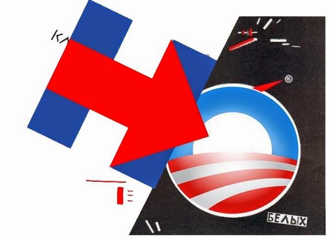
Hillary's campaign logo has come in for quite a bit of criticism.
The logo's designer, Michael Bierut, is a graphic design superstar. Maybe he knows what he is doing? Here's what he wrote a few years back on the Occupy Wall Street "communications arsenal":
Consider, on the other hand, the genius of that simple #occupywallstreet hashtag. Three little words, with a call to action built right in. And, also right there was the potential for an articulated brand architecture that any corporate identity expert could envy. "Occupy" sits in the master brand position. Fill in the blanks for a potentially infinite number of user-generated subbrands, from Occupy Amarillo to Occupy Zurich. Elsewhere in the OWS communications arsenal, we find other slogans ("We Are The 99%") and some visual tropes (the Guy Fawkes mask popularized by Anonymous, now an emerging public "face" for the protest). But no typeface guidelines, no color standards, no official logos.Could it be, as Bierut writes in his final paragraph that "Sometimes, the key to political change isn't designing a logo or poster"? He makes the same point several times in his post: "I suspect that many of its supporters would insist that the last thing OWS needs is something as simple and reductive as a logo." "conventional graphic design seems like an inefficient way to make a point, never mind to create or fuel a political movement"
I suspect there may be a method to the Hillary logo's banality. It is extremely simple to repurpose. Initially, even the Sandwichman had a few yucks:


